Adrian Ludwig Richter - "Frühlingsmorgen im Lauterbrunner Tal" in 1827. He painted this at the age of 24!
Below is my translation of the article. I looked for the author,
but couldn't find it listed. I wrote the translation in a form for
myself, not a perfect translation into English. There will be
mistakes from the idea presented in German. I probably misspelled
stuff, not paying full attention to what language I was working with. The translation not really interesting, yet the methods I am using to try to improve my German is the main idea. Image taken from Wikipedia commons.
--------------- Art lies in the Eye of the Viewer
In the East German gallery go students the question
to, what is art. Though grasp them also even to pen and paper.
Regensburg: and up once to
backfire it. The museum educator Karla Volpert clap in the hands and
we are again clear awake. We are in the East German gallery and try
here out to find, what art is. We begin with a "Fallpicture"
by Daniel Spoerri "Palindrome Banquet. Is that important art? A
assmblage of 2002 with dirty plates and glasses? Our opinion above
goes far apart.
That second artwork, that
we in the exhibition to consider, bears the name "Spring Morning
in the Loud Brunner Valley," of Ludwig Richter 1827 painted –
a detail accurate picture with a festive and happy aura. Ludwig
Richter visited the Swizz and fascinated with the area painted he the
mountain mass the virgin (young woman) in the Berner (region) upland.
What look at up on the picture? Which area is it? Which year time? To
was directs it? Was would we hear – chirp there the birds? Mooing
of the cows? Which emotion wakes the painting in us? Joy? Sorrow?
Security? Confusion? We plunge in the world of the artist.
Art
is for all to make
Of many old, detail
painted oil paintings to down to many abstract and colorful, modern,
acting plants, is in the East German Gallery in Regensburg all
available. On the walls find yourself all over information, sometimes
large, sometimes small text, the picture wrote and us this closer
brought.
It becomes apparent, that
all of us another taste have – a like rather futuristic picture,
the other time the painting of the romantic. Some paintings boring
are, others paintings touch one and some paintings appear actually
disturbing, but not inferior exciting.
Art is for all to make.
She can touch, provoke and a to the to reflect bring. That special on
the art are the colors and technique, the history narrated. The personal opinion to the art is any even to deliver. The art force many
miscellaneous emotions out, the in any miscellaneous emotions evoke.
Students
become the Artist
Nobody knows exactly, what
in the artists act, when she the brush in the hand hold. However can
man try, with the help of the painted pictures the emotions to
realize, she recreate or are all the history adds, the painter tells
would like. In a museum can man just this history listen and for
yourself decide, what man therefore feel or about what man think
will.
After this we us enough
with the each artwork dealt had, provides Volpert us charcoal
pencils, pastel and paper on. Every of us become the opportunity, a
picture, the him on any special art we know touched, choose and
ending up. We are excited. On of the ground reclining and sitting
painting we go. It arises many various pictures. Some are us
satisfied, others not at all. And again dive questions on, what is
art? Are our works art? We say – yes.
That art form East Germany
Gallery is very informative and of all exciting. Here become a the
art story near use. Each of us are certainly again coming. And you?
Ich habe Dr. Alban “Look Who's Talking” horen. Ich denke es ist ein gutes Lied. Er murmelt in
das Lied. Ich möchte die Texte verstehen. Ich suchte und las die Texte. Die Texte waren einfach, daß sie mich beeindruckten. Ich
erinnerte mich, im Radio in Jacksonville erklärte die Show, ein Mann
sei angeblich Arzt. Aber er hat Leute betrogen. Es ist illegal, als
Arzt angerufen zu werden, wenn Sie kein Arzt sind. Der Gastgeber
sagte, kann Arzt als Dr. Alban der DJ verwendet werden.
Alban Nwapa kommt aus Nigeria. Er ging
nach Schweden, um Zahnmedizin zu studieren. Um die Schulkosten zu
decken, war er ein DJ. Er hat in den Platten gesungen. Er beendete
die Schule und eröffnete eine Zahnheilkunde. Er hat den DJ behalten,
da er gut bezahlt hat. Unbekannt für das Radio, der DJ Dr. Alban ist
ein echter Arzt. Er war ein bekannter Musiker in Deutschland.
Danke fürs Lesen. Poste, wenn du
willst. Ich wüsche ihnen einen wunderbaren Tag!
------------------------------
I must practice German, to learn
German.
I heard “Look Who's Talking” by
Dr. Alban. I thought that is a good song. He mumbles in the song. I
wanted to understand the lyrics. I searched and read the lyrics. The
lyrics were simple and they impressed me. I remembered on the radio
in Jacksonville the show said a man was supposed to be a doctor. But
he scammed people. It is illegal be called a doctor when you are not
a doctor. The host said can you be called a doctor as in Dr. Alban.
Alban Nwapa is from Nigeria. He went to
Sweden to study dentistry. To pay for school, he was a DJ. Er sang in
his records. Er finished school and opened a dentistry. He kept the
DJ as it paid well. Unknown to the radio, DJ Dr. Alban is a real
doctor. He was a popular musician in Germany.
Thanks for reading. Post if you want.
Have a Great day!
Video Production - Creating Video For YouTube
Start 7/8/2019. Finished 9/13/2019.
To make videos to post on YouTube, I utilized the following:
-iPhone
-Blender
-GIMP
Making a Video:
The first step was to take video with my iPhone. Then I downloaded the video clip onto my computer.
I downloaded and installed Blender. Blender is a free, open source utility. To learn Blender I used the following tutorial videos from YouTube for Initial use, Adding Text, and Exporting the File. Adding text required the use of GIMP. GIMP is a free, open source utility.
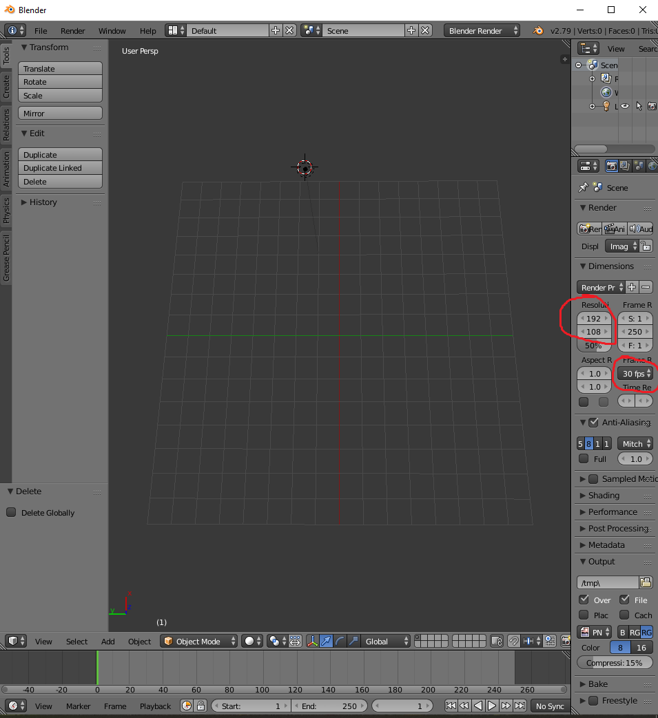
On the iPhone, go to Settings, scroll down to Camera, select Record Video, and you can select and see the video resolution and frames per second (fps). The default for my phone was 1080 at 30 fps.
I opened Blender then deleted the items on the grid by selecting them, then pressing the delete key, followed by selecting the delete option. I then confirm the 1080p and 30 fps in the settings to the right. Note, 1920p seems to be the selection with 1080p.
At the top of the screen I select the Screen Layout icon and choose Video Editing.
From a recent trip, I filmed clouds when flying by hurricane Dorian from the window of an airplane. From my file folder, I dragged the video file into a section of blender. Two bars are shown once the file is brought into Blender. The teal color is for audio, the blue is the video. Similarly, audio files can be added the same way, they just won't contain a video part.
Note: Frame rate between the iPhone and program may be slightly off. This is a problem for another discussion, but the stuff might not be in sync. For my purpose, I keep it simple, but the video setup and production may need polishing to be... perfect. If you run into issue, on the bottom of the program there is a menu that has No Sync by default. You can change this to AV-sync and it may fix some problems.
The video and audio tracks can be select by right clicking them. Left clicking the area will place a green line. At the bottom of the screen are player options such as rewind, fast forward, play, and stop. You can click the play button to play the files, they start playing at the green line. Where the green line is placed and a track selected, the k key can be pressed to cut the track into two pieces. A piece you want cut out can be deleted using the delete key then selecting the option. I cut the airplane noise then added in a guitar track. To align the audio perfectly, select the track you want to move, press the g key then hold control and drag the track to the track you want to snap it to. This method allows the program to snap the track to the other track. Then left click the track you are moving to apply it before you let go of the ctrl key. Saving the File:
In another section of blender, I clicked the current type for this area button and selected Properties.
Within the Render section for Display I selected Keep UI. Within the Output section, I selected a file where to save the video. In the same section, I clicked the drop down menus and selected FFmpeg video. In the next section Encoding, I clicked the Presets and selected to h264 in MP4. At the Audio Codec part, I clicked the drop down menu to change from None to AAC. I then scrolled back up and click the Animation button within the Render section. The program will then process the video. After completing processing, I opened the video file to see how it played.
To Add Text:
I closed everything, then reopened blender. I then dragged the video file I created into the program. At the Screen Layout of Default, I changed the resolution from 50% to 100%. I then selected Screen Layout of Video Editing. On the right there is a section with the top section labeled Edit Strip. Within that section I see my Original Dimensions are 960x540 for the video. This may be because when I made the original video, I left the 50% on. At the video I pressed the F12 key that created a screenshot. At the bottom left I selected Image and saved the image.
I then opened the GIMP program and opened the screenshot image. I then added the text at the location of the screen shot I wanted the text to appear. I then clicked the eye icon on the right, next to the screenshot so that it vanished. I am left with a check board with the text. From GIMP I Exported the image.
Back in Blender I pressed escape to leave the screenshot. I then selected Add then Image, then opened the image file.
This added an image track. With the image track selected, to the right within Edit Strip, at the Blend menu, I selected Alpha Over.
Then I dragged the image track to show where I wanted it during the video. Again, audio sync still had a problem. I changed the No Sync to AV-sync and that seemed to fix the issue. I then repeated the export process to save the video as I mentioned above.
While signed into Google, I went to YouTube, and my YouTube Channel, then uploaded and set the settings for the video. Overall, this took a good part of the day.
Thank you for viewing! Questions or issues, let me know!
Have a Great day!
Statistics: R-Practice: 101 Years of Regional High Temperatures - Part 1
8/27/2019
From https://cran.cnr.berkeley.edu/ I downloaded the latest R version.
I downloaded RStudio from https://www.rstudio.com/products/rstudio/download/#download.
I also used OpenOffice from https://www.openoffice.org/.
R is the program. RStudio is a program to make the program easier to use. OpenOffice Calc is a spreadsheet program and was used to format large amounts of data that I could then import into RStudio.
Within RStudio, I installed the dplyr package as an option for testing and summarizing data, whether or not I reported such tests in this post. I installed the ggplot2 package for graph work. I installed gvlma as an easier solution to test assumptions of a regression. To activate the packages just installed, I clicked the check box beside the package name from the package list.
From https://w2.weather.gov/climate/ I clicked the Southeast Georgia, Northeast Florida region; the green dot near Jacksonville, Florida.
After Clicking the region:
I then selected the NOWData Tab.
From NOWData I selected an area (example: Jacksonville Area), then ticked the radio button for Monthly Summarized Data, entered the year range: 1918-2018, selected from the drop down menus: Variable Max temp and Summary Daily Maximum.
Explanation of this data. The information provided is the highest temperature recorded for the month. This is a made up example: so if the temperature was 50F every day of January for the year 1950, but was 90 on the 15th of January in 1950, then the data will report only the highest for the month.
I then download data for the region, 10 different locations:
Brunswick, GA
Douglas, GA
Fargo, GA
Fernandina Beach, FL
Homerville, GA
Jacksonville, FL
Lake City, FL
Nahunta, GA
Sapelo Island, GA
Waycross, GA
To get to Sapelo Island, GA data, I went back and clicked in the area of the green dot for Savannah, Georgia.
I copied, pasted, and saved the data into a spreed sheet with OpenOffice Calc. For each location, I obtained the highest temperature recorded for the month, for each year, where the temperature was available.
From 1918-2018 is 101 total years. A temperature for each month allows for 1212 temperature readings for each location (101*12=1212). Note: although Annual data was provided, I often omitted it.
For data not available, or missing, the data has a M designation.
In OpenOffice, I used formulas to count the amount of missing, "M" data, for each location data.
Count
Formula Used
Missing
492
“=COUNTIF(B2:M102;"M")”
Present
720
“=COUNT(B2:M102)”
Total
1212
“=SUM(P1:P2)”
I calculated the amount of missing data for each location.
Missing Data
% Missing
Brunswick, GA
24
1.9801980198
Douglas, GA
292
24.0924092409
Fargo, GA
796
65.6765676568
Fernandina Beach, FL
53
4.3729372937
Homerville, GA
492
40.5940594059
Jacksonville, FL
0
0
Lake City, FL
7
0.5775577558
Nahunta, GA
514
42.4092409241
Sapelo Island, GA
514
42.4092409241
Waycross, GA
95
7.8382838284
Sum
2787
22.995049505
Why is some data missing? That is unknown. Maybe the weather station was not put in place, reading were missing, natural disasters, etc. Some stations are missing less than others. I mention it here to evaluate the amount of data available, and that results will not include missing data.
To help analyze the data, I needed to "clean-it-up" or "reformat" it. Such a change was moving Month columns to a single column Month, yet keeping each entry for that year. This is easier said than done, and there may exists better methods, but I:
Selected the data in OpenOffice Calc.
Then went to Data > Pivot Table.
I moved the Year to the Row Fields.
I moved the Months to the Data Fields column.
The pivot table formatted the Year, Month, and Temperature more how I wanted.
I further cleaned up the table by filling out the year in the blank cells and setting the Months.
For me, RStudio had problems processing missing values. I deleted the blank missing value place holding cells.
With the data formatted how I wanted it, I then saved the OpenOffice document as a .csv file.
I Imported the .csv file with the data into RStudio. Once in RStudio, I can now run some queries and generate some statistics.
What is the hottest temperature ever recorded for each of the ten locations?
Note my data is named p6.
I enter this into RStudio
# A tibble: 10 x 2
City Temp
<fct><int> 1 Brunswick 106
2 Douglas 106
3 Fargo 105
4 Fernandina 104
5 Homerville 104
6 Jacksonville 103
7 Lake City 106
8 Nahunta 104
9 Sapelo Island 105
10 Waycross 108
Starting from scratch:
Import the data, in this example, labeled p6.
I then checked the tick boxes beside the dplyr, ggplot2, and gvlma packages.
These tasks can also be performed entering the code as shown below.
The data, p6, looks like this:
#Ill start using this blue color to show code# t10 <- p6 %>% group_by(City,Year) %>% summarise(Temp = max(Temp)) %>% filter(City == "Brunswick")
gg<-ggplot(t10, aes(Year, Temp, colour = Temp)) + geom_point(aes(col="red", size=))+ #geom_smooth(method="loess", se=F)+ geom_smooth(method="lm", se=F)+ ylim(c(90,110)) + xlim(c(1918,2018))+ labs(subtitle="Brunswick 101 Year High Temperature", y="High Temperature", x="Year from 1918 to 2018", title="Southeast Regional High Temperature", caption="Source:https://w2.weather.gov/climate/") plot(gg)
I'll try to translate.For the first part, I am creating data called "t10" from data p6, that is being adjusted %>% by grouping City and Year adjusted %>% using the summarise function on Tempareture searching for the maximum temperature, adjusted by %>% a filter for information only on the City of Brunswick.
The second part creates data of gg by using the ggplot function on t10 for Year and Temperature making the temperature a color. geom_point function orders a graph to be a point graph, with red points, of the default size of the points. The #geom_smooth portion is dullified due to the #, it is not used. I left it here to show that. Next geom_smooth is utilized, using the method "lm" and that line created the blue 'best fit line' that in the graph looks like the high temperatures are decreasing. ylim and xlim define the y and x axis start and stop measurements. The labs puts the headings and subheadings around the graph. plot(gg) tells the program to show the created graph.
I then entered: ###################################### #Adds regression line statistics fit1 <- lm(Temp ~ Year, data = t10) summary(fit1) ######################################
The lines with a # do nothing but show text. fit1 is data created from the lm function for Temperature and Year, taken from the t10 data. The summary function displays the information generated for fit1:
Call:
lm(formula = Temp ~ Year, data = t10)

Residuals:
    Min      1Q  Median      3Q     Max
-5.6279 -1.5277 -0.5232  1.3220  6.3493

Coefficients:
              Estimate Std. Error t value Pr(>|t|)
(Intercept) 108.695842  14.385123   7.556 2.12e-11 ***
Year         -0.004554   0.007309  -0.623    0.535
---
Signif. codes:
0 ‘***’ 0.001 ‘**’ 0.01 ‘*’ 0.05 ‘.’ 0.1 ‘ ’ 1

Residual standard error: 2.141 on 99 degrees of freedom
Multiple R-squared:  0.003907, Adjusted R-squared:  -0.006154
F-statistic: 0.3883 on 1 and 99 DF,  p-value: 0.5346
This code provided the same result: #This runs the Regression test. #I believe the results provide the equation for the line. linearMod <- lm(formula = Temp ~ Year, data = t10) summary(linearMod)
How did I know to do all this? You have more questions of what this all means?
Here is the citation: http://r-statistics.co/Linear-Regression.html For an explanation.
It is a good read. It further mentions assumptions. Assumptions must be met, if the statistics
shown are to mean anything useful.
Another citation: http://r-statistics.co/Assumptions-of-Linear-Regression.html
#1.Regression model but be linear in parameters.
#I guess look at it, does it look like a line? The blue line does to me.
#2.The mean residuals is zero. To test this: #This Tests for Assumption #2 of a Regression. #2 is that residuals are zero.") mean(fit1$residuals) #If this number is super small, its close to zero
> #2.The mean residuals is zero. To test this:
> #This Tests for Assumption #2 of a Regression.
> #2 is that residuals are zero.")
> mean(fit1$residuals)
[1] -9.510063e-17
> #If this number is super small, its close to zero
The number is very small, it is close to zero. This assumption is good to go.
###################################### #This tests for assumption #3: #Homoscedasticity of residuals or equal variance. par(mfrow=c(2,2)) # set 2 rows and 2 column plot layout mod_1 <- lm(Temp ~ Year, data = t10) # linear model plot(mod_1) #4 Plots should appear. #If the top left and bottom right plots are flat lines, #Then it appears homoscedasticity is accepted. ###################################### #Assumption 4, no autocorrelation of residuals. lmMod <- lm(Temp ~ Year, data = t10) acf(lmMod$residuals) #A graph will appear. If the lines from the center line #appear to go beyond the blue dashed line (a lot), then #Autocorrelation might be confirmed. #So staying within the blue lines is a good thing, #Allowing to run the test. ###################################### #Assumption 5 #The X variables and residuals are uncorrelated. lmMod3 <- lm(Temp ~ Year, data = t10) cor.test(t10$Year, lmMod3$residuals) #The p-value is near 1, then assumption holds true. #All is good. A small value near zero would be bad, #as in not meeting the assumption. ###################################### #There are 5 more assumptions, but it got repetitive.
#I installed the gvlma package to run the following: #This code checks assumptions for regression, the easy way. #It even explains stuff. par(mfrow=c(2,2)) # draw 4 plots in same window mod <- lm(Temp ~ Year, data = t10) gvlma::gvlma(mod)
So what does this double rainbow mean? I circled the p-values. They are all above 0.05 meaning nothing appears out of the ordinary. Do consult a textbook, but regressions try to make a line to predict where a point will fall... sort of. From our graph and the line, if another year was added either way or squeezed in between the others, a data point will most likely be similar to the others. Main Takeaway: The Year has no affect on the High Temperature. For this 100 year look, it appears the high temperatures have stayed the same. Once this is told, people then have asked me so global warming isn't really happening? Not, that is not what this is telling us. This is for high temperatures, for the past 101 years, taken from a weather station in Brunswick, GA. If you want to talk global warming, you need more than one location. Having more than 101 years of data can help too. This global warming discussion is not over, but for this post, this would not prove global warming, noting what we are analyzing. What this does kind of tell me is that in recent years, the hottest the temperature has gotten has been less than the average of the highest temperature for a year, for the past 101 years, but I just looked at the dots to come up with that, not the statistics. How can I use this data? I can go back to my Granny in Bruswick and tell her that a local weather station reports that since ~2010 the temperature has not gotten as how as it was in 90s, early 2000s.
But then again, what does science and statistics know. Granny tells me every year it is hotter than the previous year. She told me today that this year was hotter than ever!
Reinactment of what actually took place:
I do hope to posts on this data including information for the region. Yet to begin, I started with just Bruswick, and this post became very long.
Thank you for viewing! Have a Great day!
Questions or comments, let me know!


